.svg)




Seven small habits — and the exact clicks behind them — that quietly make any document easier to navigate, read, and trust.
For designers, agencies, analysts, consultants, founders — really, anyone who sends out documents that need to look the part.
Seven small habits — and the exact clicks behind them — that quietly make any document easier to navigate, read, and trust.
For designers, agencies, analysts, consultants, founders — really, anyone who sends out documents that need to look the part.

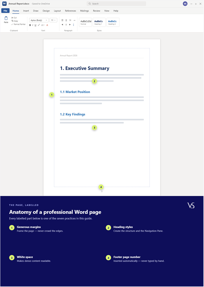
Anatomy of a professional Word page—every part below is one of the seven practices
Before you start
Here’s something easy to forget: a document makes its first impression before anyone has read a word of it. A messy layout makes good thinking look careless. A clean one makes even ordinary content feel credible. And the good news is that in Word, almost all of this comes down to a small set of features most people simply never switch on.
So that’s what this guide is about. Seven layout practices, and for each one you get the idea in plain English, the exact steps to do it in Word, a labelled picture of what it should look like, and a quick word on why it’s worth the bother. No design background needed—you just need to know where the buttons are.
1. Design for Navigation, Not Just Reading
Most people scan a document before they ever read it—so build it to be jumped around.
So that’s what this guide is about. Seven layout practices, and for each one you get the idea in plain English, the exact steps to do it in Word, a labelled picture of what it should look like, and a quick word on why it’s worth the bother. No design background needed—you just need to know where the buttons are.

2. Create Consistency That Builds Credibility
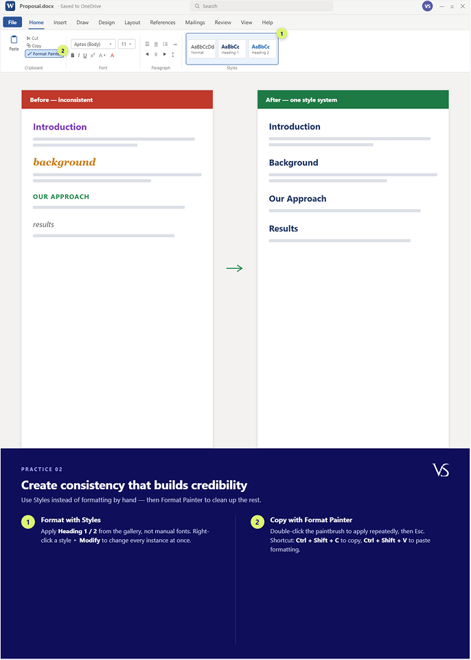
Use Styles instead of formatting by hand—then Format Painter to clean up the rest.
Mismatched fonts, uneven spacing, headings that don’t quite line up—none of these is a big deal on its own. But together they’re a series of tiny snags, and each one nudges the reader to notice the formatting instead of the message. Consistency smooths the snags away so your content gets the attention, not your typography.
3. Use Visual Hierarchy to Direct Attention
Let size, weight, and colour tell the reader what matters before they read it
Not everything on a page matters equally, so nothing should look like it does. That’s all hierarchy really is. A big bold title, medium headings, calm body text underneath—and suddenly people can take in how the whole thing is organised at a glance, before they’ve read a line.

4. Prioritise Readability Over Page Density
Give it room to breathe. White space isn’t wasted space—it’s what makes dense content readable.
We’ve all felt the urge to squeeze everything onto fewer pages. It backfires every time. Tight, wall-to-wall text raises the effort it takes to read and quietly drains the reader’s patience. Spacing, on the other hand, might be the cheapest upgrade you can make to a document—a few clicks and the whole thing feels lighter.

5. Give Every Visual Element a Purpose
A table should help people read—give it a header row and banding, not a bare grid.
Tables, charts, callouts—they’re all meant to make information faster to grasp. A plain grid of cellsdoes the opposite. It technically shows the data, then leaves the reader to do all the scanning workthemselves. A little styling is all it takes to turn that grid into something you can actually read at aglance.

6. Build Templates That Scale Across Teams
Format it once, save it as a .dotx template, and let everyone start from the same shell.
When every document gets built from scratch, consistency is basically impossible and the review cycles drag on forever. The teams that have figured this out treat documents as a system instead of a one - off:a branded template carries the styles, the logo, and the structure, so nobody has to reinvent any of it on a Tuesday afternoon.

7. Evaluate Documents by Usability
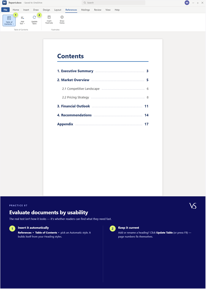
The real test isn’t how it looks—it’s whether readers can find what they need, fast.
A document can be beautifully formatted and still completely fail the person reading it. The honest measure is usability: can people find what they need quickly, spot the key messages, and wo rk out the next steps without straining? An automatic table of contents is about the simplest usability win going — and most people still build them by hand.
Keep-this Shortcut Cheat Sheet
If you only ever learn a few Word shortcuts, make it these—they do the most work in every day document layout.