.svg)





“Practical ways to design slides that help people decide —instead of just talk.”

1. Executive Summary.
Good analysis doesn’t automatically lead to a good decision. I’ve watched plenty of sharp, well-researched recommendations walk out of a room with nothing settled—and the reason usually isn’t the thinking. It’s the slide. The slide asked people to work out the answer for themselves instead of helping them decide.
That’s really the whole difference between two kinds of slide. A discussion slide lays out the information and quietly leaves the audience to piece together the conclusion. A decision slide does that work for them: it puts the recommendation front and centre, shows why the other options lost, names the trade-offs, ties each finding to a real business consequence, and finishes with a clear next step. It sounds like a small distinction. In practice it’s the difference between a meeting that closes and one that gets scheduled again.
This note walks through four techniques for turning recommendation slides into something people can actually decide on. Each one targets a specific habit that tends to creep in as a deck gets reworked. Here they are at a glance.
2. Introduction
Most consulting presentations are built around a recommendation. By the time you're in the room, the analysis is done, the alternatives have been weighed, and you've landed on a direction. And yet the meeting still ends without a decision. It happens far more often than people admit.
he reason is simple, even if it's easy to miss: presenting a recommendation isn't the same as helping someone evaluate one. Your slide can hold exactly the right answer, but if the audience is still debating alternatives, reading the data their own way, or wondering what it all implies, the conversation stays stuck in discussion. Nobody decides anything.
Decision slides take uncertainty off the table and make the choice easier to weigh. Discussion slides do the opposite — they hand the analytical work back to the audience. Spotting which kind of slide you've actually built is almost always the first step toward a deck that moves things forward.
3. Why It Matters
In a senior meeting, time is the one thing nobody has enough of. So when a slide makes a CEO, a board, or an investment committee reconstruct your logic on the spot, you pay for it three ways:
- Decisions slow down. Every bit of interpretation you push onto the audience stretches the conversation and pushes the actual decision further away.
- Credibility takes a hit. A deck that wanders suggests the team hasn't quite made up its own mind — and that's the fastest way to lose a partner or a client sponsor.
- Old debates come back. When people can't see how you got to the answer, they reopen options you already closed, and you end up redoing work you'd finished weeks ago.
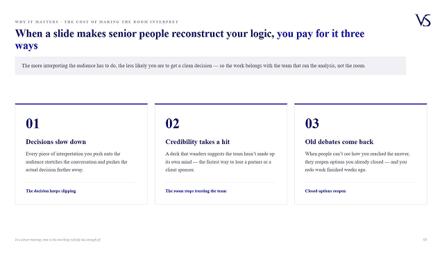
The pattern is consistent: the more interpreting the audience has to do, the less likely you are to get a clean decision. Decision slides simply move that work back where it belongs — onto the team that ran the analysis in the first place.
4. Key Concepts
Discussion slide vs. decision slide3
The most useful idea in this whole note is the contrast between two kinds of slide. They can look almost identical on the screen, yet they behave completely differently once the room starts talking.
.png)
The four habits that quietly turn a recommendation into a discussion
Here's the thing — discussion slides almost never start out that way. Most of them began life as a clean recommendation with solid analysis behind it. Then the deck goes through reviews. Evidence gets added. Someone's alternative viewpoint gets worked in. Stakeholder comments get folded back. Each change feels like an improvement, and in a way it is — the slide gets more complete. But complete and clear aren't the same thing, and the recommendation gets harder to see.
Drift like that tends to show up in four ways:
- The supporting analysis grows louder than the recommendation it's supposed to support.
- People read the same chart through different priorities and reach different conclusions.
- Findings explain what's happening but never get around to why it matters.
- An observation flags a problem and then just.... stops, without pointing to a next step. Each of the four techniques below is the fix for one of these.
5. The Four Techniques, in Detail
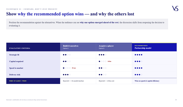
A lot of recommendation slides spend all their energy explaining the option you chose and almost none explaining why you passed on the others. That leaves a gap. People may follow the recommendation perfectly well and still keep drifting back to the alternatives — not because they disagree, but because they can't see how those options got ruled out.
The fix is to put your recommendation next to the alternatives rather than on its own. Don't just list what's great about the path you picked; show why the others fell away — on strategic fit, on the investment they'd need, on how hard they'd be to implement, on what they'd actually deliver. Once people can see why one option pulled ahead, the conversation stops being "should we reconsider?" and becomes "let's pressure-test this."
Technique 2 — Make the trade-offs visible
.png)
A surprising number of long meetings aren't really arguments about the recommendation at all. They're arguments about trade-offs nobody has named out loud. One person is optimising for speed, another for cost, a third for risk — and as long as those priorities stay hidden in the analysis, everyone talks past each other.
Decision slides drag the trade-offs into the open. They say plainly what each option gives you and what it costs you, which hands the room a shared way to judge the choice. That doesn't end the debate, and it shouldn't. What it does is make sure everyone is debating the same decision on the same terms — which is exactly what makes the debate worth having.
Technique 3 — Connect findings to business implications
.png)
Plenty of slides answer "What happened?" beautifully. Far fewer answer the question that actually drives a decision: "So what does this mean for us?" That's the gap where momentum dies.
A finding like falling retention or rising operating cost is information, and information on its own rarely moves a leader to act. People still need to know how it hits their priorities, their investments, their risk, their direction. Decision-oriented slides close that gap by stating the implication right after the finding. Once the consequence is spelled out, weighing the recommendation gets a whole lot easier.
Technique 4 — Turn observations into actions
.png)
The clearest tell of a discussion slide? It ends on an observation. "Customer demand is climbing." "Costs are rising." "Adoption is still below target." All perfectly true — and all of them leave the audience holding the same unspoken question: so what do we do about it?
Decision slides answer that question. Instead of closing on what you learned, they close on what should happen next. It's a small shift in wording, but it changes everything: information becomes direction, and the room ends up weighing a proposed action rather than puzzling over an observation.
6. Before and After
The rewrites below take each technique and apply it to a single headline or closing line. Notice that the underlying analysis never changes — only the framing moves from discussion to decision.
.png)
7. What Good Looks Like
- Lead with the answer. Put the recommendation in the headline and let the support sit underneath it. Someone reading nothing but the titles should still reach the right decision - that's the Pyramid Principle doing its job.
- Write headlines that say something. "Partnership is the fastest route to scale" is a headline. "Market entry options" is a filing label.
- Keep your options MECE. When you compare alternatives, make them mutually exclusive and collectively exhaustive, so the comparison is fair and nothing's missing
- Judge every option the same way. Score them all against the same criteria - fit, cost, effort, risk, outcome — so the choice clearly rests on evidence.
- Name the trade-off, not just the winner. Always pair your pick with what it gives up. An option with no apparent downside just looks like you didn't examine it.
- Give every finding a "so what."Never leave a number on a slide without the consequence sitting right next to it.
- End on the action. The last thing they read should be the decision you want them to make.
8. Common Mistakes to Avoid
.png)
- Letting the recommendation get buried. Supporting material piles up until the recommendation is just one item among many. Catch this early in the review cycle, before it sets.
- Showing only the option you chose. Leave out why the others lost and you're basically inviting people to bring them back.
- Hiding the trade-offs. A recommendation that looks cost-free reads as suspicious, not convincing.
- Reporting without interpreting. Stopping at "what happened" and leaving the audience to guess the "so what."
- Ending on an observation. Closing with a fact instead of a next step. This is the discussion slide in its purest form.
- Over-stuffing the slide. Adding context for every possible question until the main message drowns. Completeness isn't the goal here — a clear decision is.
9. A Few Things the Pros Do
These are the small habits that separate a polished associate from someone who's genuinely meeting-ready.
- Watch for review-cycle drift. Recommendations rarely lose clarity because the recommendation changed — they lose it because the supporting content grew faster than the message. After every review round, check that the recommendation is still the loudest thing on the slide.
- Try the headline-only test. Read just the slide titles, in order. If they tell the full decision story on their own, you're ready. If they read like a list of topics, you've still got a discussion deck.
- Say "so what?" out loud. Point it at every finding on the page. If you can't answer in a single sentence, the implication is missing.
- Name the trade-off the client is dreading. The quickest way to earn trust is to raise the downside before they do — then show why it's worth it.
- Get ahead of the rejected option. Before a big meeting, find out which alternative each stakeholder secretly likes, and make sure the slide explains why it didn't win
10. The Bottom Line
.png)
Strong analysis doesn't hand you a strong decision. When recommendations are hard to compare, trade-offs stay hidden, implications are fuzzy, or observations stop short of an action, the audience ends up doing more interpreting than they should - and the more they interpret, the more the conversation spreads out and the slower the decision gets.
Decision slides lighten that load. They make the recommendation easy to weigh, put the trade- offs on the table, tie findings to what they mean for the business, and turn observations into actions. The four techniques here are just the disciplined way to do that, draft after draft after draft.
11. A Quick Checklist
Run any recommendation slide past this before it lands in a client deck. If you can't tick all seven, it's still a discussion slide.
- The recommendation is the first thing your eye lands on.
- The headline states a conclusion or an action — not a topic.
- The rejected options are shown, with the reason each one lost.
- The trade-offs are explicit: what you gain, and what you give up.
- Every finding has its "so what" sitting right beside it.
- The slide ends on a recommended action, not an observation.
- Reading the headlines alone tells the whole decision story.